하쿠시 로고가 왜 뾰족뾰족한지 아세요?
2018년, 가게 이름을 ‘흰 도화지’로 정한 뒤 두 개의 일본어 단어 사이에서 고민했습니다.
하쿠시(白紙)와 시로가미(白紙).
둘 다 흰 종이를 뜻했지만, 결국 선택한 이름은 하쿠시였습니다.
그 이유는 요리와 관련이 있습니다.
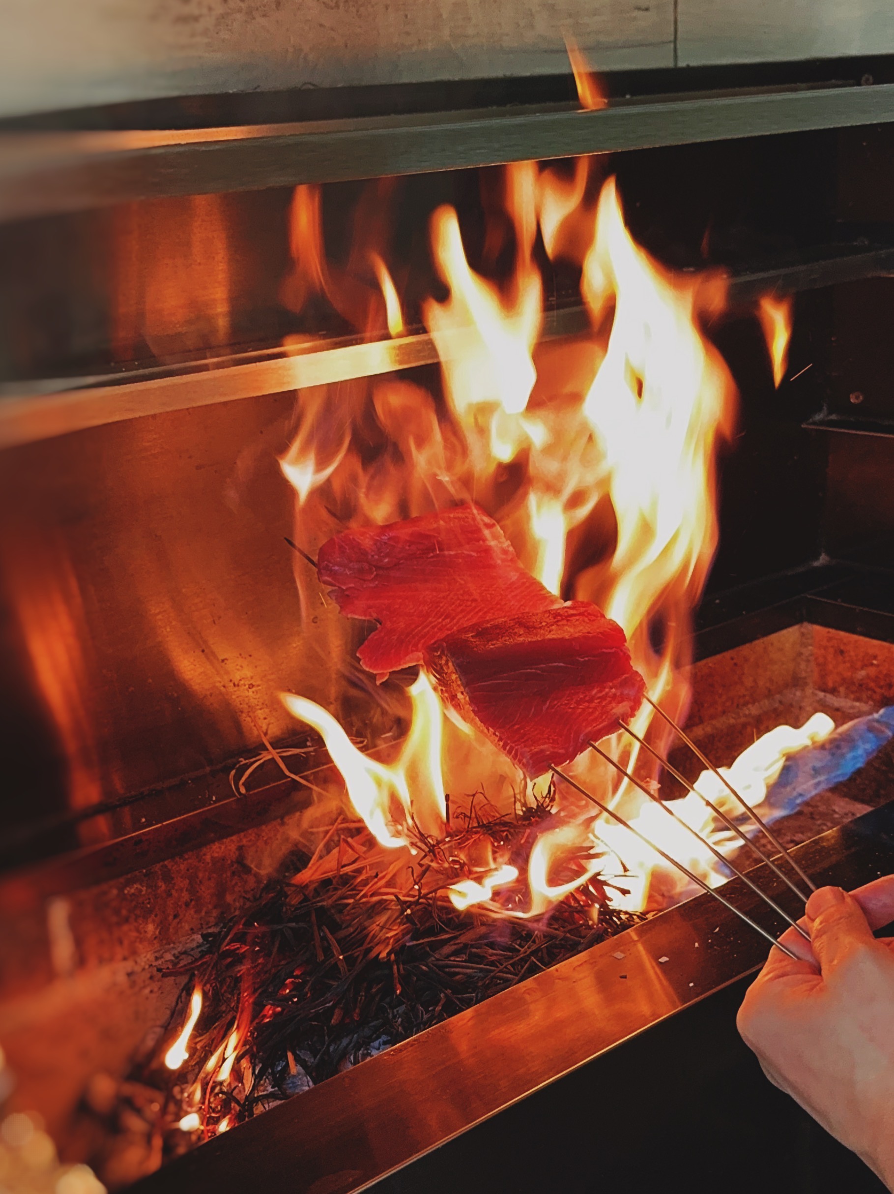
하쿠시의 요리는 숯불에서 완성됩니다.
생선과 고기를 쇠꼬챙이에 꽂아 숯불 위에서 굽는데,
일본에서는 이 꼬챙이를 쿠시(串)라고 부릅니다.
하쿠시는 흰 도화지를 뜻하는 이름이면서도,
그 안에 자연스럽게 ‘쿠시’라는 소리를 품고 있었습니다.
아무것도 그려지지 않은 백지와,
숯불 앞에 서 있는 쉐프의 가장 익숙한 도구.
그 두 가지가 하나의 이름 안에서 만났을 때, 이것이 우리의 이름이라는 생각이 들었습니다.
그래서 로고의 형태에도 그 의미를 담았습니다.
HAKUSI의 위를 향한 모든 글자 끝을 뾰족하게 다듬은 이유입니다.
흰 도화지 위에 그려지는 한 접시.
그리고 숯불 위를 오가는 쿠시들.
하쿠시라는 이름과 로고에는 우리의 이야기가 담겨 있습니다.
In 2018, after deciding on the name “White Canvas,”
we found ourselves choosing between two Japanese words:
Hakushi (白紙) and Shirogami (白紙).
Both mean a blank sheet of paper, but in the end, we chose Hakusi.
The reason had everything to do with cooking.
Many of Hakusi’s dishes are finished over charcoal.
Fish and meat are skewered on thin metal rods and grilled over the fire.
In Japanese, these skewers are called kushi (串).
While Hakushi means a blank sheet of paper, it also naturally contains the sound “kushi.”
A blank canvas with nothing drawn on it,
and the tool most familiar to a chef standing in front of the charcoal grill.
When those two ideas came together in a single name, we knew we had found ours.
That meaning also found its way into the logo.
The reason every upward-pointing stroke in HAKUSI was sharpened into a point is to echo the shape of a kushi.
A plate drawn upon a blank canvas.
And the kushi moving back and forth over charcoal.
The name Hakusi, and the logo that carries it, hold a piece of our story.